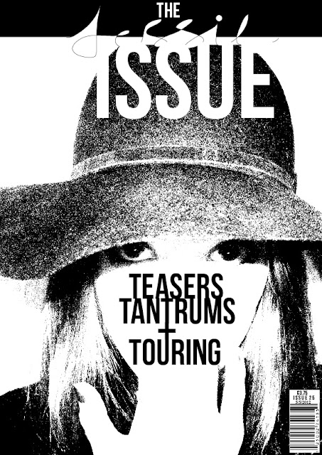
THE 'JESSIE' ISSUE
This is one of the covers I have produced for the 'Jessie' issue of my magazine. I particularly like it because of the strong image used that has piercing direct eye contact with the reader and I like the fact that it challenges so many conventions and isn't your typical music magazine cover. The white space that has been created through the over exposure of the image and the increased levels of brightness and contrast is particularly effective as it created a place to position my single cover line and to give my cover line a blank background so that it is easily readable. Also, I wanted the cover line to stand out to show the design of the text linking downwards from the letters to emphasize this running design feature on all the cover lines on each issue's cover. I also think that this cover is symmetrical and follows the rule of thirds which I particularly like and initially intended for this cover. I also like the positioning of the word 'Issue' as it looks as though it has been cut out almost, since the background behind is white. The white text sort of merges into the white background which I really like and am particularly pleased with. I think out of the three covers I have produced this is the strongest and the one I am most pleased with as it is unique and is unconventional when compared to other music magazines already in the magazine market.
THE 'MILES' ISSUE
This is another cover I produced for my music magazine. I liked the image I chose because the van is featured heavily in the image and I thought that the blank space created on the door of the van would be a really good place to position a cover line or text as it would stand out against the simple background of the door. I also liked it because Miles has direct eye contact with the camera and therefore the reader which directly addresses and engages a reader. I also wanted to use a mid-shot to experiment away from the head shot style images I used in my other two covers, just to show that the magazine will differentiate between the more close up head shot images and long shot and mid-shot cover images so the magazine doesn't become predictable or even boring after a while to its readers.I think this is again an effective cover, particularly due to the fact it complies with a running theme and house style of having a black and white, over exposed image as the cover image and has very similar features as the 'Jessie issue cover. This instantly shows and reveals a trending brand identity which will make the magazine instantly recognisable to the public. I really like how the cover line merges into the image through the black wheel of the van and think this is really effective and makes the magazine look well designed and somewhat professional. I also like how the cover line is blunt and straight to the point, making it quick for a potential buyer or reader of the magazine to find out a bit about the magazine content and what that issue has to offer. Again, there is a lot of white space on this cover making it really stand out to the eye of a reader and accommodating space for text and a cover line to really stand out. I also really like how the model Miles is centre of attention in the image as he is a lot darker in the image than the van he sits in, making the reader instantly see him and draws instant attention to him which emphasizes the fact that the cover is for the 'Miles' issue and that it is going to be centred around him or there will be an article about him. I do really like this cover but I wish I had perhaps tried it with more of a head shot style image to keep it similar to the 'Jessie' issue cover. However, I am glad I experimented with doing a cover that wasn't a head shot style image as I think it is still a really effective cover and I think it's important to vary the covers since the cover lines and mastheads for each issue are very similar. I don't want readers to grow bored of having very similar covers each month and I want to keep the magazine exciting.

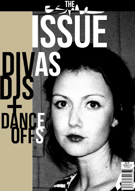
THE 'ESME' ISSUE
I think this cover was effective in attracting a reader and I think some elements of it still comply with a house style for the magazine, with the black and white theme and the joining text and letters. But, I think in some ways this cover goes against the typical style of the other two covers as it has a bold block of beige colour on the left hand side which differentiates it to the other two covers which only include a main image and a cover line that is central to the page. The image and how it was edited is also very different and I don't like it as much as my other covers as the adjustment of brightness and contrast levels didn't seem to be able to create the same black and white pop art effect image as it had done in the 'Miles' and 'Jessie' issues, and it is a lot darker and there isn't any blocks of white space like in the other two covers. I do however, like how striking the image is and the model's facial expression as it has direct eye contact and will immediately catch a readers eye. It is conventional in that it has a barcode at the bottom, but apart from that this cover is again very unconventional which I like as it will be something new and unique and exciting to the magazine market. Although this cover is slightly different to the other two covers due mainly to its choice of image and where its cover line is placed, I think it was good to experiment with a slightly different style of image and layout to show that the magazine will be different each month whilst still having some of the same features and conventions, such as its strong recognisable masthead and the bar code for example.
.jpg)
FRONT COVER PHOTOSHOOTS/IMAGES:


.jpg)