
Wednesday 8 May 2013
Saturday 4 May 2013
F I N A L C U T O F T R A I L E R
This is the final and finished version of our trailer 'Cirque'.
Untitled from jessie keegan on Vimeo.
Untitled from jessie keegan on Vimeo.
T I T L E S
I have created these titles using InDesign to go into our trailer to add a sense of storyline and plot, and to add some narrative. This is one of the things that was really emphasized in all of the feedback we received from the first draft viewing. The idea of the titles is that they are quotes from local newspapers and news channels reporting the events surrounding the travelling circus, and I thought this was a good way to narrate our trailer and quite a unique way of doing so.
The first title is to set the scene and is quite innocent and not scary at all, building suspense and not letting on that anything bad has happened yet. The second title is suddenly introducing the idea that there have been murders at the circus. This title goes well with the heightened sense of urgency that the footage and trailer is now reaching. As the suspense and tension builds, the final title is the most extreme title urging people to 'lock their doors', hinting that this clown character is on the loose and very dangerous. The build up of these titles I think will be really effective at not only building up suspense and action but also letting the viewer know what will be going on roughly in the film itself.
The design I incorporated into the titles relates well to my poster design too, with the coloured lines that look quite graphical and arty.


T R A I L E R F E E D B A C K (AUDIENCE/CLASS FEEDBACK)
We were able to do a showing of our first rough cut trailer to our class and three teachers and we made a questionnaire for them to fill out.
1.Our peers thought that our establishing shots were to light and un-threatening so they suggested that we grade the images so that they are darker and build on the idea that the trailer is for a horror.
These are the results from the audience feedback questionnaires:
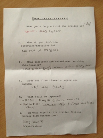
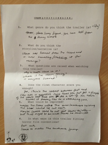
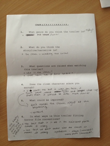
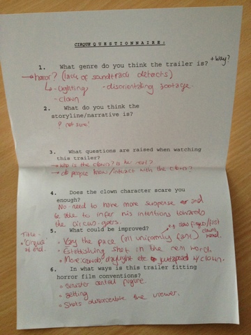
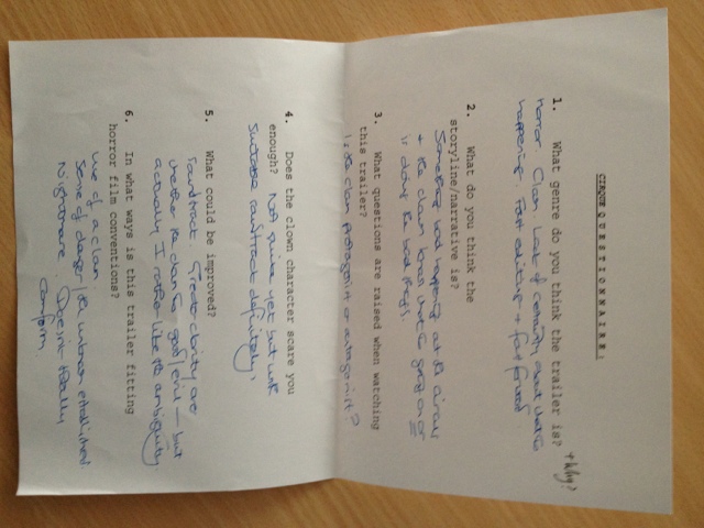
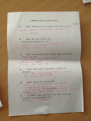
1.Our peers thought that our establishing shots were to light and un-threatening so they suggested that we grade the images so that they are darker and build on the idea that the trailer is for a horror.
2.They said they thought the clown (the killer) is introduced to early on in the trailer and they think it would be better if he was introduced near the end to create shock, but our best visual shots have the clown in and we really like using the spinning tunnel at the beginning as we find it quite chilling so we will have to discuss what we are going to do about this.
3.They said that they liked how the fast shots were edited but they think that we should use more of a variation between slow and fast. Perhaps a slow cut of the hands round the door in slow motion and then a quick shot of the clowns head close up, this would create building tension then shock.
4.They liked the titles that had been used but they thought we should explain more of the story with them, maybe use reviews as titles or a newspaper cutting with something like “mysterious deaths at local circus”
These are the results from the audience feedback questionnaires:
T R A I L E R F E E D B A C K (FROM MODERATION)
www (What Went Well):
- You have so much great footage. The whole trailer has the potential to be absolutely brilliant.
- Looking through the footage you have not yet incorporate into the trailer, you have more than enough shots of the public to hint effectively at the narrative (contrasting the normal life of the circus with the ominous clown).
- We loved your long, leggy shadow shots!
ebi (Even Better If):
- Think very carefully about how you are going to cut the clips together to build pace and tension. Remember, when you are editing a trailer you only need 1 or 2 seconds of footage to show the audience what is going on. You shouldn’t tell the story or follow a chronology, but think about how you can use length of shots and contrast of light/dark, normal/sinister, etc to raise questions and build tension.
- Re-watch some of the indie and horror trailers you analysed to remind yourselves of how many – and how short – the shots are.
- You need to include: BBFC screen, title (at end, rather than beginning?). Actors names? You can get away with being very minimalist in how much you give the audience, but experiment with including conventional title shots, and then try stripping them back.
T E A S E R F I R S T C U T
This is the first rough cut of our trailer:
TRAILER 21ST APRIL from jessie keegan on Vimeo.
This is a very rough cut of the trailer and it still needs a great deal of work, including adding titles and a soundtrack. However, it was helpful to start putting all the shots together into some kind of order and sequence. We now need to focus on the things we need to add to it and we will also be getting feedback next week from both moderation and also from our class so we can use this feedback to improve it further.
N E W A N D F I N A L W E B S I T E D E S I G N
This is my new and final website design which I will now make into a website using Dreamweaver and also embed my trailer into.
WEBSITE URL: http://www.stmaryleboneschool.com/studentsite/Media%20A2/Jessie/index.html
I have followed the feedback I received and have made a new website design which not only follows the feedback I got but also now relates to my new poster design too. The white box is where the trailer will be inserted and there are going to be links to the official Twitter, Facebook and YouTube pages of Cirque.
 |
WEBSITE URL: http://www.stmaryleboneschool.com/studentsite/Media%20A2/Jessie/index.html
I have followed the feedback I received and have made a new website design which not only follows the feedback I got but also now relates to my new poster design too. The white box is where the trailer will be inserted and there are going to be links to the official Twitter, Facebook and YouTube pages of Cirque.
I think this website design is a lot more effective than my first draft design which was much too bright and cheerful. I think that having the black background is a lot more scary and typical of a horror genre website. I have also tried to keep the website related to my poster by including the same imagery and graphics and also the billing box, ratings and title.
W E B S I T E F E E D B A C K
I received this feedback, after moderation, for my website:
- Same as poster – experiment with a dark background to make the genre more explicit.
- Play around with a billing box (beneath the trailer) and incorporate Ts & Cs.
- I’m not sure about the font for ‘the circus is coming to town’. I don’t think the simplicity quite works – consider blurring the text, and playing with colour.Since I have already updated and completely changed my poster in order to work on the feedback I got for it, I will now have to both follow this feedback and also make a new website design that is based upon my new website design, which is a lot more scary, with the inclusion of much darker colours.Since my new poster is mainly black in colour, my new website will also be black to relate to the poster and therefore should hopefully therefore allow me to make sure that my new website follows this feedback I have just been given.
W E B S I T E D R A F T
This is the first draft that I made of my website, still with my first draft poster in mind when I made it. I made this quite quickly and therefore I am really not pleased with it but hopefully when I receive feedback for it I can input changes and improve it, or even make a new one if I decide to change my poster too. I also wasn't able to use very good fonts as I made it on the school computer and couldn't download new fonts, so I want to change these at some point.


Subscribe to:
Posts (Atom)